You've found the perfect empty wall. It's wide enough to matter, blank enough to bother you every morning, and absolutely crying out for something with intention. One lone print won't cut it — and a pair always looks like something is missing from the middle. That's exactly where a three-piece botanical wall art set earns its place.
For anyone who's never hung a triptych before, the format can feel intimidating. Spoiler: it isn't. With the right measurements, a clear colour direction, and downloadable files you can print the same afternoon, it's the single most beginner-friendly wall decision you'll make.
The Triptych Formula: Exact Sizes and Spacing That Actually Work
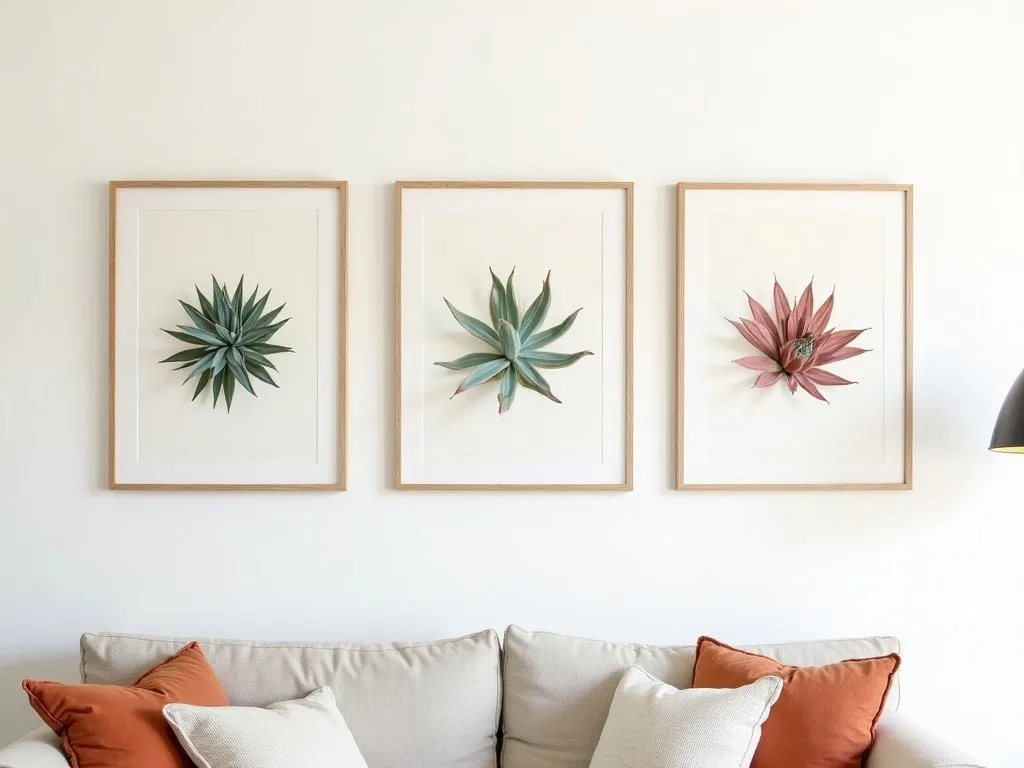
Forget guesswork. The format that works consistently in European living rooms and bedrooms is a wider centrepiece flanked by two matching verticals — and the proportions below are what we recommend at Flora Digital for a balanced result on a standard wall.
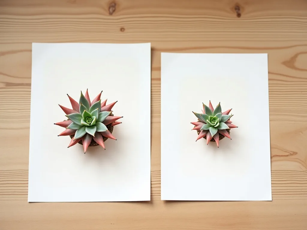
- Centre panel: 40×50 cm (portrait orientation)
- Side panels: 21×30 cm each (portrait, aligned to the top edge of the centrepiece)
- Gap between panels: 5 cm on each side
- Total wall width required: approximately 90 cm
That 90 cm footprint fits comfortably above a double bed headboard, along a hallway wall, or behind a desk without overwhelming the room. The 5 cm gap is intentional — tight enough to read as a unified composition, wide enough to let each botanical print breathe as its own piece. When you align the tops of the side panels to the top of the centrepiece rather than centring them vertically, the eye travels across the arrangement naturally, left to right, like reading a sentence.
For framing, simple white or natural oak frames in matching depths (around 2–3 cm) keep the set cohesive. If you prefer a frameless look, foam-board mounting with flush clips gives a clean, gallery-style finish at a fraction of the cost.
Three Room Scenarios With Specific Palette Pairings
The botanical triptych format is unusually flexible — the same layout reads completely differently depending on which room it lives in and which palette surrounds it. Here are three worked scenarios to help you decide where yours belongs.
Bedroom — warm sage and cream. A sempervivum botanical print rendered in warm sage tones against a cream or off-white background brings a grounded, organic calm to a bedroom. Pair with linen bedding in oat and eucalyptus, warm bulb lighting, and wooden frames. The result is a wall that feels curated, not decorated.
Hallway — charcoal line-art. Narrow hallways need contrast to avoid feeling like a tunnel. A three-piece set in crisp charcoal line-art style — fine botanical illustration lines on pure white — holds the eye as you pass. Keep walls light (white or pale greige) and let the art carry the visual weight. No shelf, no competing prints; just the triptych and space.
Home office — muted terracotta and botanical green. If you're designing a workspace that needs energy without chaos, a botanical wall art set mixing terracotta-warm backgrounds with deep botanical greens does exactly that. It reads professional on video calls, stimulating enough to beat screen fatigue, and pairs well with dark wood desks or burnt-orange stationery details.
Digital Downloads vs. a Framed Physical Triptych: The Numbers Tell the Story
A custom-framed triptych from a high-street frame shop in Switzerland — three prints, three frames, professional sizing — will typically cost upwards of CHF 180–250 once you factor in materials and labour. Delivery or collection adds time, and if you change your mind about the colour palette later, you're back to square one.
A downloadable botanical wall art set from Flora Digital costs a fraction of that. You receive high-resolution files instantly — the same day, often within minutes of purchase — and you can print at your local copy shop or home printer at exactly the sizes you need. If you later decide the bedroom version should be in sage rather than charcoal, you download the alternative and reprint one panel. The flexibility is built in.
There's no waiting for shipping, no risk of damage in transit, and no commitment to a frame colour chosen under fluorescent shop lighting. You print when you're ready, at the size that suits your wall.
How to Choose the Right Botanical Print Style for Your Set
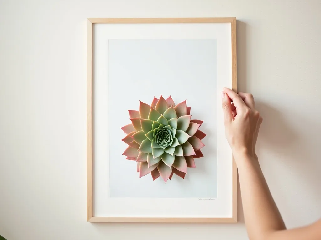
Not all botanical prints are designed to live together as a triptych. When selecting a set, look for three things: a consistent rendering style across all three panels (so the line weight and tonal range match), a shared background value (all light or all dark, not mixed), and a subject that scales gracefully — sempervivum succulents work particularly well because their rosette geometry holds detail at both 21×30 cm and 40×50 cm without losing its structure.
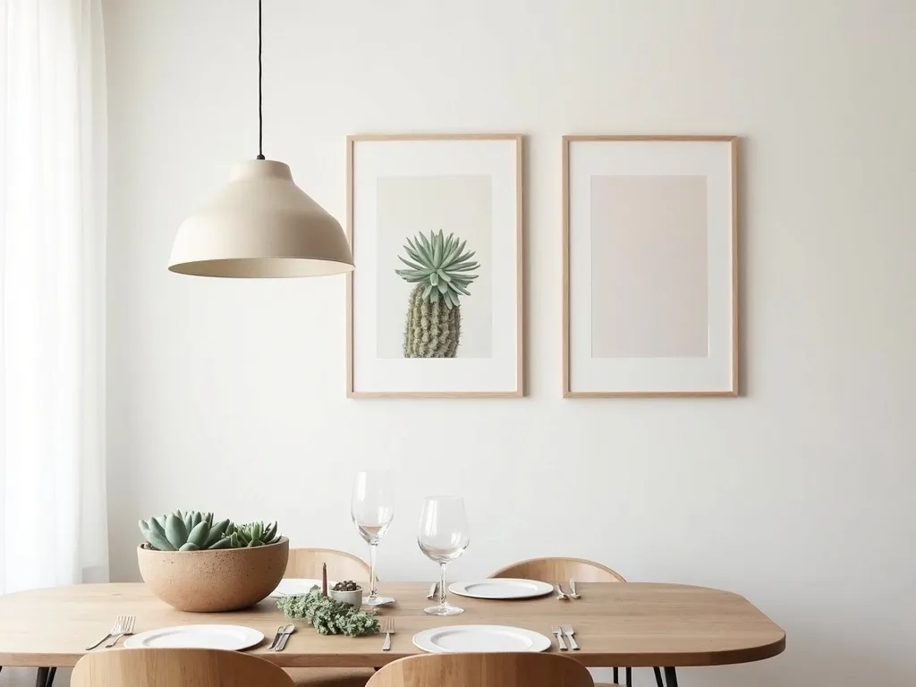
If you're shopping for wall art for living room spaces specifically, lean toward compositions with lower contrast and more breathing room around the subject — the eye needs somewhere to rest when the print hangs in a social space that's already rich with texture and colour.
Not sure which palette suits your current room? Use our colour match tool to cross-reference your wall colour and furniture tones before you download.
Ready to find your set? Browse the full range of three-piece sempervivum compositions at Flora Digital's botanical collection — every set is available as an instant digital download, sized and ready to print today.