Staring at a blank wall and wondering where to start is one of those problems that sounds simple until you're standing there with a tape measure and no plan. A gallery wall layout lives or dies by the decisions you make before anything touches the wall — the print count, the sizing ratio, the breathing room between frames.
This guide gives you three layout formulas you can use immediately, with real centimetre measurements and specific print sizes. Every number below has been tested against standard European wall proportions, and the botanical print sets from Flora Digital are sized to slot straight into each template.
Three Ready-to-Hang Layout Templates
Think of these as architectural blueprints. Pick the one that matches your available wall space and frame budget, download your prints, and execute.
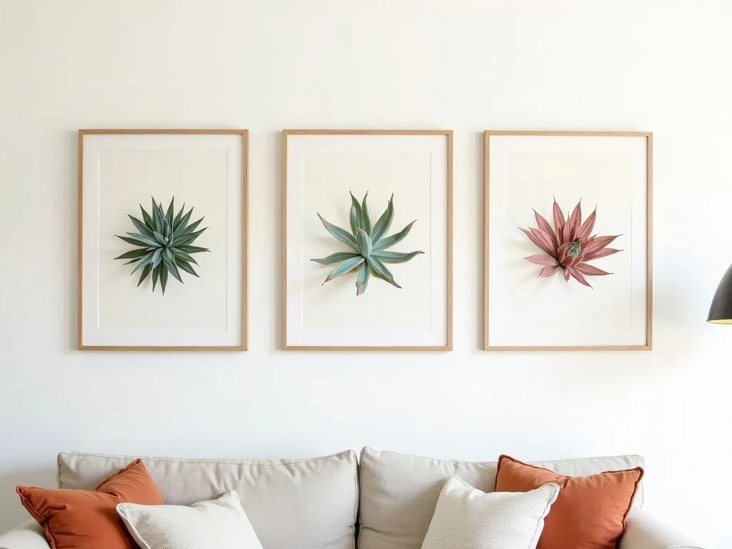
Template 1 — 3-Piece Linear (for walls 80–120 cm wide) Arrange three 30×40 cm prints in a horizontal row. Leave exactly 6 cm between each frame. Total wall footprint: roughly 102 cm wide × 40 cm tall. This works above a console table, a headboard, or a narrow hallway shelf. Keep all three frames portrait orientation for a clean, considered look. Three prints, one row, zero ambiguity.
Template 2 — 5-Piece Asymmetric (for walls 140–180 cm wide) Place one 40×50 cm print slightly left of centre as your anchor. To its right, stack two 21×30 cm prints vertically with 4 cm between them. To the left of the anchor, do the same — two more 21×30 cm pieces stacked. Maintain 8 cm between each column. The asymmetry comes from offsetting the stacked pairs by 5 cm vertically relative to the anchor's midpoint. Total footprint: approximately 155 cm wide × 60 cm tall. This is the layout that looks intentional rather than accidental.
Template 3 — 9-Piece Grid (for walls 180–240 cm wide) A 3×3 grid of 30×40 cm prints. Space each frame 5 cm apart horizontally and vertically. Total footprint: 110 cm wide × 130 cm tall. Before you commit, hang a paper template on the wall — grid layouts punish even a 2 cm misalignment, so use a spirit level on every row. The payoff is a statement wall with real visual weight, perfect for the main wall of a living room.
Portrait-Only vs Mixed Orientation — How Wall Width Decides
This is the choice most people skip, and it shows. Here's a direct comparison:
120 cm wall: Stick to portrait-only. Mixing landscape and portrait frames on a narrower wall creates visual noise — your eye doesn't know where to land. The 3-piece linear template above (102 cm footprint) leaves comfortable breathing room at the margins. Botanical prints in portrait orientation reinforce the vertical growth lines of Sempervivum, making the composition feel intentional and organic.
200 cm wall: You have room to mix orientations. Consider anchoring with a 50×70 cm portrait hero print, then flanking it with one or two 40×50 cm landscape pieces at staggered heights. The variation in orientation creates movement across the wall — which is exactly what a wide expanse needs to avoid looking like a row of identical windows. Pull the landscape frames up by 8–10 cm relative to the portrait pieces to create a gentle diagonal rhythm.
Use our gallery wall planning tool to map your exact wall dimensions before you download anything — it lets you test template footprints against your room measurements.
Colour-Blocking for Visual Hierarchy
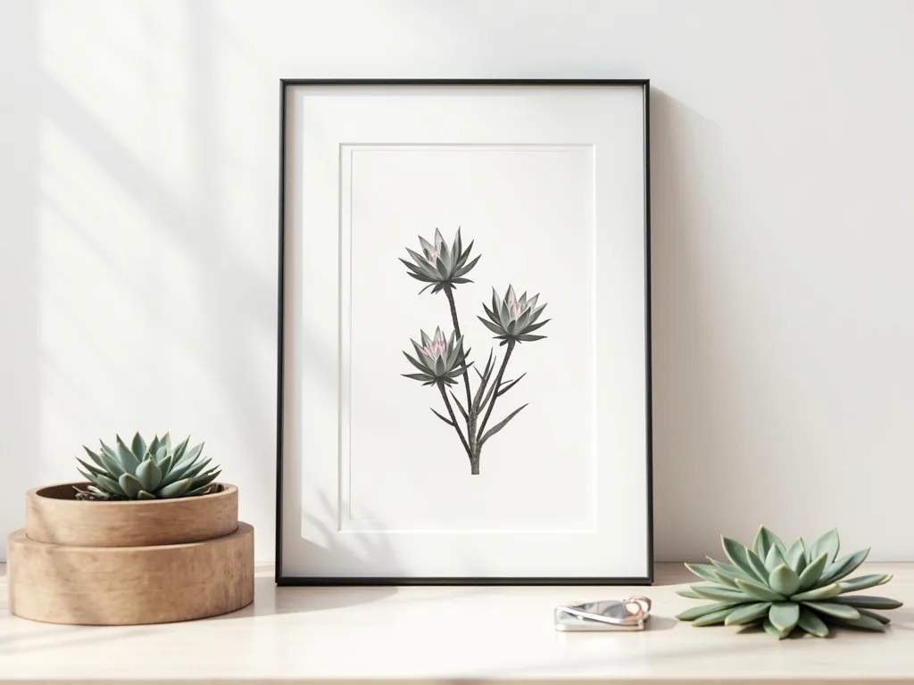
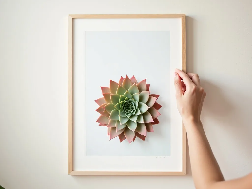
Size alone doesn't create hierarchy. Colour placement does — and with botanical prints, you have a natural palette of sage greens, dusty rose, silver-grey and deep burgundy drawn from the Sempervivum rosette itself.
The formula: anchor your layout with one 50×70 cm hero print in the deepest, most saturated tone of your chosen palette. Flank it — left and right, slightly lower — with 21×30 cm accent pieces in a lighter, more muted variant of the same colour family. The larger print draws the eye first; the smaller ones hold it. The tonal step-down (saturated anchor → muted accents) is what makes the whole arrangement feel curated rather than collected.
A worked example: a 50×70 cm Sempervivum print in deep burgundy-green as the centrepiece, paired with two 21×30 cm prints in pale silvery-green on either side, 10 cm gaps between frames. Against an off-white or warm linen wall, this three-piece colour-blocked set reads as a single composed artwork — not three separate purchases.
Sizing Your Prints to Your Room, Not Your Wall
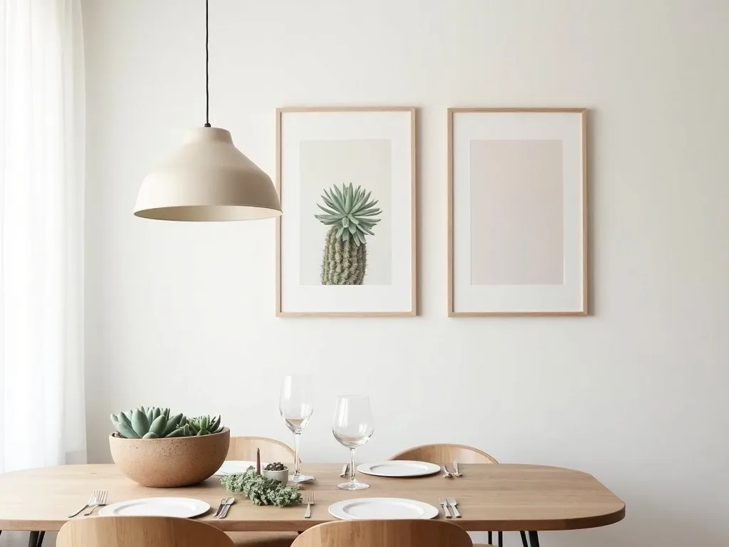
The wall is only part of the equation. A 50×70 cm botanical print that looks commanding in a 30 m² living room can feel overwhelming in a 12 m² bedroom. A useful rule: the total horizontal span of your gallery wall layout should occupy 55–70% of the furniture piece below it — sofa, sideboard, bed — not 55–70% of the bare wall. This grounds the arrangement visually and stops it from floating.
For living room wall art specifically, err toward the larger formats (40×50 cm and 50×70 cm) because viewing distances are greater. In a hallway or study, 30×40 cm prints hit the right scale without crowding the space.
All Flora Digital botanical prints are delivered as high-resolution digital files sized precisely for these standard formats — no cropping, no guesswork, ready for your local print lab or home printer.
If you're ready to build your layout, start with the coordinated sets in the botanical print collection — each set is designed with tonal harmony already built in, so the colour-blocking strategy above comes naturally. Pick your template, measure your wall, download your prints. The blank wall ends today.