You've pinned the mood board, chosen the sofa, and painted the walls — yet the space above the sofa still looks like a question mark. A gallery wall for living room settings is one of the highest-impact changes you can make, and it's almost always the last thing people tackle because it feels complicated. It doesn't have to be.
This guide works through the actual numbers: how wide your arrangement should be relative to your sofa, which botanical palette flatters which wall colour, and a clever vertical-print trick that makes low ceilings disappear. By the end, you'll know exactly which prints to download and how to place them.
The Sofa-Width Rule: Start With a Tape Measure, Not Pinterest
The single most common gallery wall mistake is going too small. A lone 50×70 cm print floating above a 220 cm sofa reads as an afterthought, not a design choice. The rule interior stylists use is simple: your total arrangement should span 75–85% of the sofa's length.
Run the numbers for your room:
- 180 cm sofa → aim for an arrangement 135–153 cm wide (think 4–5 prints)
- 210 cm sofa → aim for 158–179 cm wide (5–7 prints work well)
- 240 cm sofa → aim for 180–204 cm wide (7–9 prints, or a mix of sizes)
For a typical European three-seater at 210 cm, a staggered grid of six 21×30 cm botanical prints — three across, two rows — sits beautifully within that range and leaves breathing room between frames. Add a seventh slightly larger anchor print (30×40 cm) at the centre of the lower row and the whole arrangement gains a focal point without feeling cluttered. Sketch the layout on paper first, cutting out rectangles to scale, before you put a single hook in the wall.
Colour Matching: Which Botanical Palette Works With Your Sofa
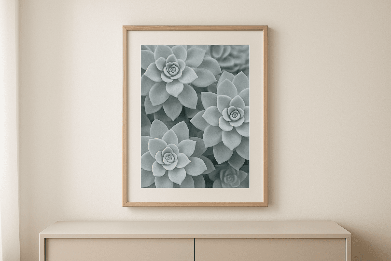
Sempervivum botanical prints tend to arrive in three natural palettes at Flora Digital — and pairing the right one to your sofa colour is what transforms a nice arrangement into a cohesive room. Here's a quick reference:
| Sofa colour | Best botanical palette | Why it works | |---|---|---| | Cream / ivory | Warm beige line-art | Tonal layering; the art reads as a natural extension of the sofa | | Light or mid grey | Sage green + warm beige mix | The green pops against cool grey without clashing | | Navy blue | Charcoal line-art | Deep contrast; the graphic quality of charcoal suits navy's boldness | | Terracotta / rust | Sage green | Complementary colours on the wheel; the combination feels earthy and grounded |
If your wall is painted rather than white, factor that in too. A dusty pink wall with a sage botanical print can look muddy — here charcoal line-art is far cleaner. A deep forest green wall, on the other hand, is the perfect backdrop for warm beige prints that glow against it like parchment.
When ordering a multi-print set, pick prints from one palette family rather than mixing all three — even subtle palette inconsistencies read as noise once the pieces are on the wall together.
The Low-Ceiling Trick: Portrait Prints as Vertical Lines
If your living room has a ceiling height of 240 cm or under — very common in European apartment blocks — a horizontal arrangement of landscape prints will only emphasise the compressed proportions. The fix is counterintuitive but reliable: go exclusively portrait orientation.
Portrait prints in 21×30 cm or 30×40 cm format create vertical lines that pull the eye upward before it reaches the ceiling. Hung with around 4–5 cm of gap between prints, a column of three 21×30 cm pieces measures just 98 cm top-to-bottom (including gaps) but reads as a tall, architectural element. Your ceiling doesn't shrink the room — the prints extend it.
For a 240 cm ceiling, hang the top edge of your uppermost print at around 180–185 cm from the floor. That positions the arrangement in the upper visual field without crowding the cornice, and keeps the midpoint of the arrangement near eye level when you're seated.
Hanging Without Frames: A Clean, Renter-Friendly Option
You've downloaded your files and had them printed locally — now you need them on the wall without drilling. Frameless options are genuinely viable for botanical prints at these sizes:
Poster rails (available at most European home stores) clamp the top and bottom of the paper and can be swapped out whenever you update your set. A 30×40 cm print in a slim black rail looks intentionally minimal, not budget.
Adhesive poster strips rated for up to 2 kg hold a single A3 (29.7×42 cm) print on most smooth-plastered European walls. Test one corner first, especially on lime-wash or textured finishes.
Clipboards or bulldog clips mounted on picture hooks add a relaxed, studio feel that suits botanical line-art especially well — the utilitarian clip contrasts nicely with the delicacy of a Sempervivum drawing.
All three approaches let you rearrange prints seasonally, swapping in new downloads without touching the wall layout.
Building Your Set: Where to Start
If you're working with a 210 cm sofa and a sage-green palette, a practical starting point is a set of five to seven Sempervivum botanical prints in portrait format — three at 21×30 cm and two or four at 30×40 cm. Download, send to a local print shop on matte 200 gsm paper, and you'll have your wall art for living room ready within a day.
Browse the full range of studio-designed Sempervivum prints — including curated palette sets — in the botanical collection. Not sure which arrangement fits your specific wall dimensions? Use the gallery wall planner to map out your layout before you download a single file.
Start with your sofa measurement. Everything else follows.