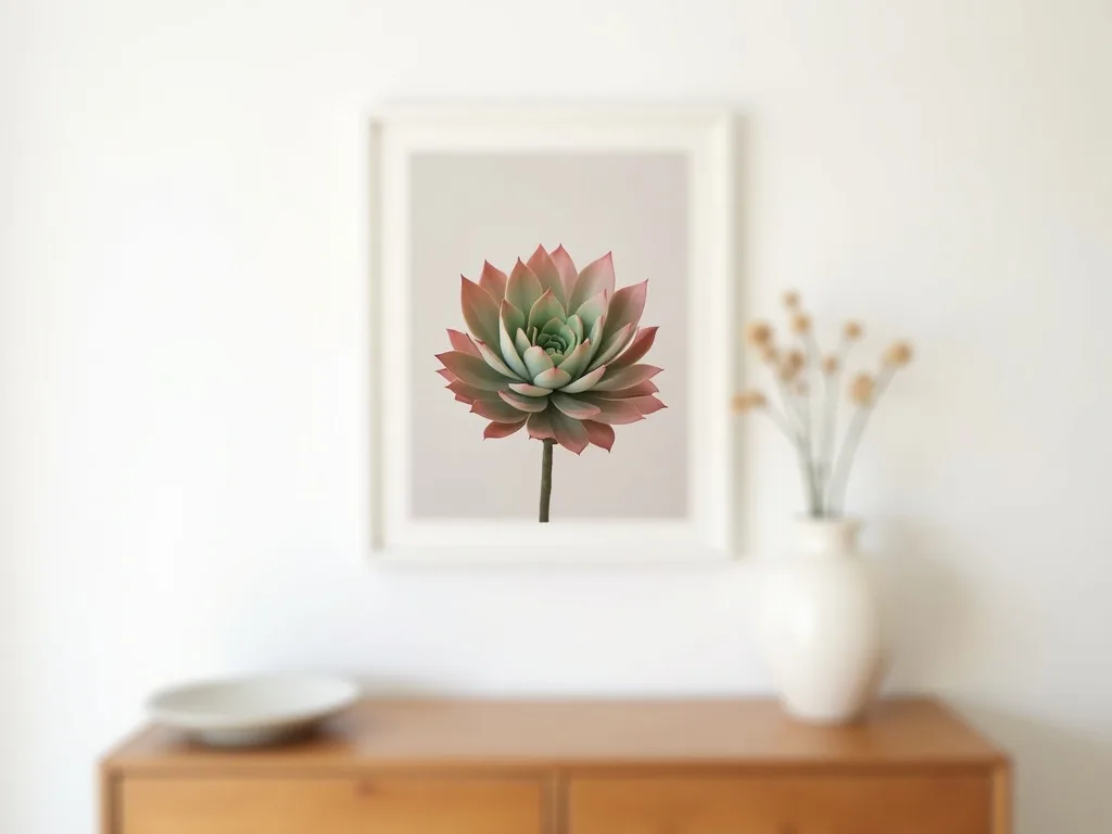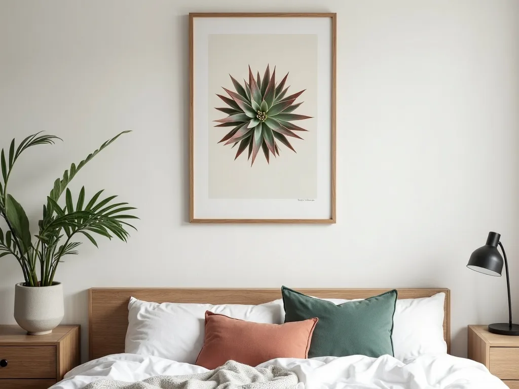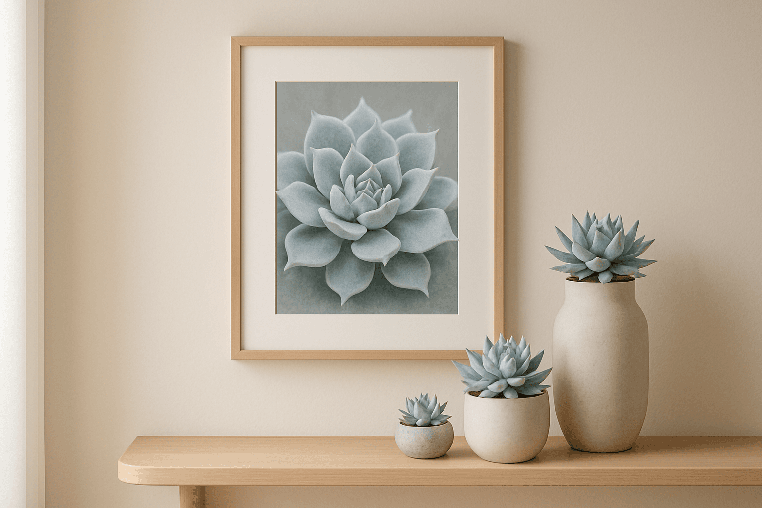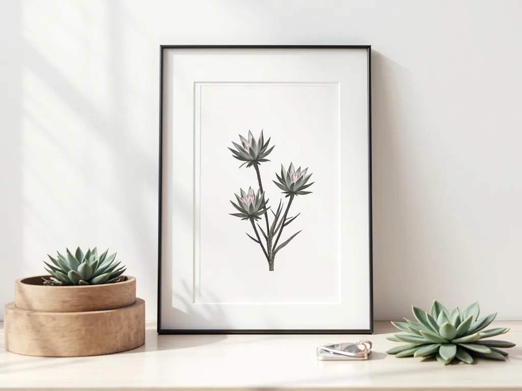
You love botanical art. You've saved dozens of images, bookmarked a handful of shops, and then — nothing. The soft sage green feels too risky next to the terracotta cushions. The dusty pink version might date badly. The teal is gorgeous but the sofa is already doing a lot. So you close the tab and buy nothing.
Sound familiar? Then a black and white botanical print is the answer you've been circling around. It's not the cautious choice — it's the confident one. Here's exactly why, and how to make it work in your space.
The Contrast-and-Texture Principle: Visual Richness Without Colour Risk
The persistent myth about monochrome wall art is that it plays it safe — that removing colour means removing personality. The opposite is true, especially with botanical subjects. A Sempervivum succulent rendered in fine line art is built from hundreds of overlapping curves, from the tight inner spirals of a rosette to the papery outer leaves catching imagined light. That level of detail creates what interior stylists call visual texture — the eye travels across the surface, finding new forms, much like it does with a woven textile or a patterned tile.
Colour, paradoxically, can flatten this. When ink and wash compete with a bold hue, the eye picks a winner. In a black and white botanical print, the structure is everything. It holds its own against exposed brick, works beside a gallery of family photographs in mixed frames, and doesn't flinch when you repaint the wall behind it. In a mixed-décor home — where the sofa is one era, the sideboard another, and the rug is frankly a third — this neutrality isn't compromise. It's coherence.
Choosing the Right Frame: Three Room Scenarios That Actually Work
The frame is where a monochrome print either sings or disappears, and the logic is simpler than most styling guides admit.
Black frame on a white or pale plaster wall. This is maximum contrast, and it earns it. In a home office with white walls and natural linen curtains, a slim black aluminium frame — around 30×40 cm — creates a focal point that reads as intentional and considered, not accidental. The botanical print inside becomes an object of almost architectural weight.
White frame on a dark or deeply saturated wall. If your living room features a charcoal feature wall, a forest-green alcove, or even deep navy panelling, a white or off-white wooden frame lifts the print forward rather than receding into the dark. The white border adds breathing room and prevents the image from feeling heavy. A 21×30 cm print in a white frame on a dark wall has the effect of a lit display case — quiet but impossible to ignore.
Natural wood frame in Scandinavian or warm-neutral interiors. Pale oak or ash frames sit beautifully in rooms where the palette runs to oat, cream, warm grey, and undyed linen. The wood introduces warmth that a black frame would cut through unnecessarily, and keeps the whole arrangement feeling organic — which is entirely appropriate for a botanical subject. This combination works especially well in a bedroom, where the visual temperature should stay gentle.
The 3-Print Monochrome Set Formula (For Beginners Who Want a Gallery Look)
If you're new to hanging art in multiples, start here. This formula takes the guesswork out of a gallery strip without requiring any design experience.
Choose three prints at 21×30 cm (A4) and vary them by scale of subject, not by style — the style is already unified by the monochrome palette.
- Close-up macro — a single succulent rosette filling almost the entire frame, every petal visible.
- Mid-distance — one or two plants with visible negative space around them, a natural composition.
- Wide or grouped — a looser arrangement of several specimens, receding into the background.
Hang all three in a horizontal strip with 5–8 cm between frames. This works perfectly above a desk (hang the strip at eye level when seated, approximately 120–130 cm from floor to centre of the middle print), or beside a doorway where vertical space is limited but you still want impact. The scale variation means each print has a different visual rhythm, so the trio feels curated rather than repetitive — even though every element is the same palette.
Where Monochrome Prints Earn Their Keep: The Rooms That Benefit Most
As wall art for a living room, a black and white botanical print is nearly unbeatable in rentals and transitional spaces — the ones you're not yet ready to commit to a full colour scheme. It also thrives in:
- Hallways, where natural light is limited and colour can look muddy — monochrome stays crisp regardless of bulb temperature.
- Home offices, where the visual environment should be calm enough not to compete with the screen.
- Bathrooms, where humidity over time can shift the appearance of coloured inks on physical prints — your digital file, of course, is unaffected, and you can reprint if needed.
- Rented bedrooms, where you cannot repaint and the existing wall colour may be unpredictable.
In every one of these scenarios, the print adapts — not because it lacks character, but because its character is structural rather than chromatic.
Ready to stop hesitating and find your prints? Browse the full black and white botanical collection — each piece is a studio-designed instant download, ready to save and print the moment you check out. If you'd like to plan a multi-print wall before you commit, the gallery wall tool lets you map your exact space in minutes.
There's no colour to clash with. There's nothing to get wrong. There's only the print, the wall, and how good it's going to look.