You've already made the call: nature belongs on your living room wall. The harder questions are the ones nobody tells you upfront — how big, which colours, and exactly where on the wall it earns its place. Get those three things right and a single botanical print can quietly anchor an entire room.
This guide gives you concrete answers. No mood-board vagueness, no "it depends" hand-waving. Just the numbers, the pairings and the placement logic you need to order with confidence.
How to Choose the Right Scale for Your Wall
The most common mistake buyers make is going too small. A 30×40 cm print centred on a 180 cm stretch of wall doesn't read as art — it reads as an afterthought. Use this as your starting rule:
- Wall width 100–140 cm (a chimney breast, a narrow alcove): one hero piece at 40×50 cm fills the space without overwhelming it. Hang it so the midpoint sits at eye level — roughly 150–155 cm from the floor.
- Wall width 140–200 cm (a standard sofa wall): step up to 50×70 cm as a single statement, or create a 3-piece set using three 30×40 cm prints arranged in a horizontal row with 4–6 cm gaps between frames. The trio reads as one composed work and gives you more flexibility with colour mixing.
- Wall width above 200 cm (an open-plan living space or feature wall): go bold with a 70×100 cm centrepiece, or build a 5-piece gallery arrangement. A staggered grid of five 40×50 cm botanical prints — two on top, one offset in the middle, two on the bottom — creates deliberate rhythm without the rigidity of a perfect rectangle.
Because Flora Digital's files are instant digital downloads, you print at the exact size that suits your wall. No cropping, no compromise.
Matching Your Botanical Palette to the Season — and Beyond
If you want nature wall art for your living room that works twelve months of the year without a single cushion swap, the trick is to anchor the print's palette to your room's fixed tones — floor, sofa, shelving — rather than your seasonal accessories.
That said, palette does carry a seasonal mood worth leaning into:
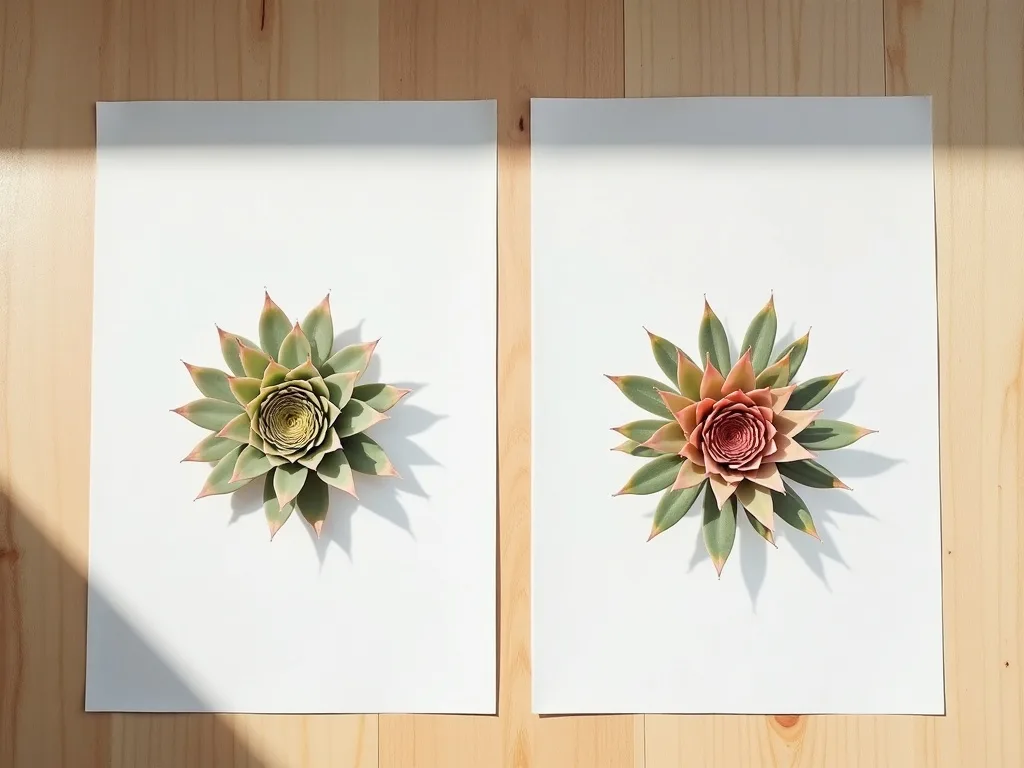
Autumn and winter interiors feel grounded by botanical prints in warm amber, deep rust and burgundy. Sempervivum succulents rendered in these tones — think burnished copper rosettes against a near-black background — complement dark wood floors, terracotta ceramics and the kind of heavy-weave throws that come out in October. The contrast is rich rather than stark.
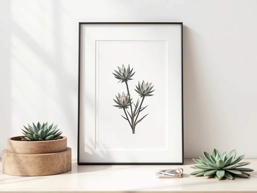
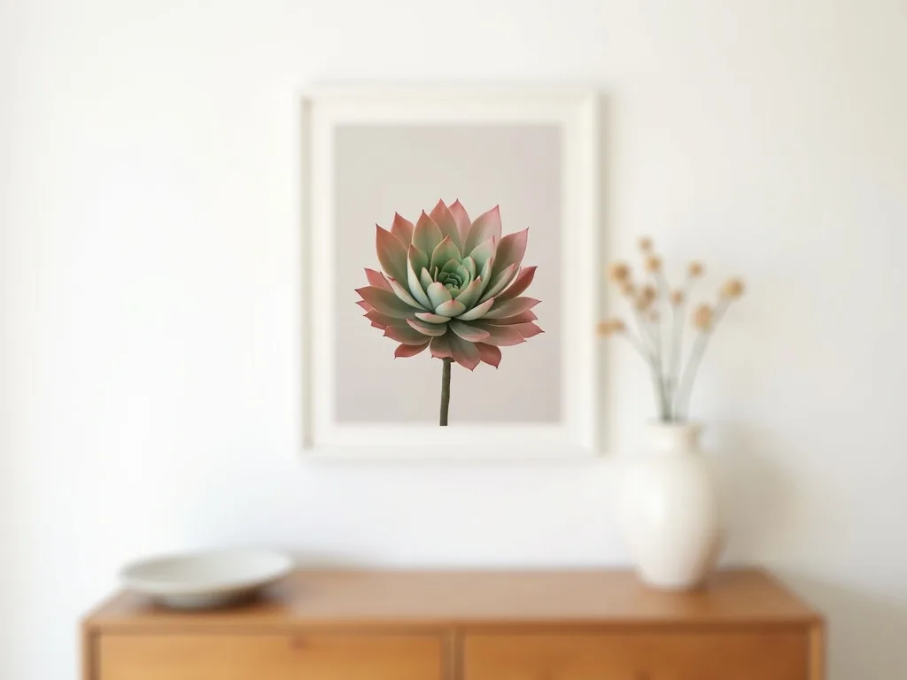
Spring and summer interiors open up with sage green, soft cream and dusty blush. A botanical print in these tones sits beautifully against white plaster walls, rattan furniture and linen upholstery. The art feels airy rather than decorative.
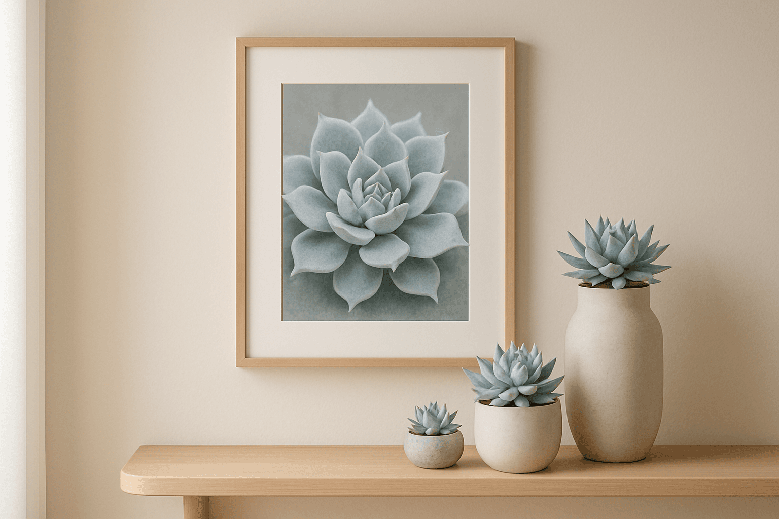
For a year-round solution that needs no seasonal edit: choose a botanical print with a neutral stone or warm grey background and a succulent whose leaf tones carry both warm and cool notes. Many Sempervivum varieties do exactly this — their rosettes shift from green at the centre to deep violet or bronze at the tip, so the print reads differently depending on what you place around it. One art piece, two seasonal readings.
Light Exposure Changes Everything
Before you decide on a dark-background versus light-background print, stand in your living room at noon and be honest about the light you're working with.
South-facing rooms receive long hours of direct or near-direct light. Here, dark-background botanical prints come into their own. The rich, almost velvety backgrounds — deep charcoal, forest green, near-black — hold their depth under bright light and make the botanical detail pop without looking washed out. A dramatic 50×70 cm Sempervivum print on a dark ground becomes a focal point rather than a decoration.
North-facing rooms receive cooler, more diffuse light throughout the day. Dark backgrounds in these rooms absorb the limited light and cause the artwork to visually recede — you stop seeing the art and start seeing a dark rectangle. The fix is deliberate: choose high-contrast botanical prints with light or white backgrounds. Cream and pale sage backgrounds reflect the available light back into the room, keeping the botanical detail crisp and the colours alive. If you want a darker palette in a north-facing room, compensate with a warm-toned picture light mounted directly above the frame.
A Worked Example: The Warm-Neutral Living Room
Let's make this concrete. Imagine a living room with a 160 cm sofa wall, north-facing windows, a warm oak floor and an oatmeal-coloured sofa.
The right move: a 3-piece set of 30×40 cm botanical prints in sage green and cream, hung in a horizontal row at 150 cm centrepoint, gaps of 5 cm between each print. The light background fights the diffuse northern light. The sage tones echo the oak floor's warmth without matching it too literally. The trio format fills the 160 cm wall proportionally — each print contributing without any single one dominating.
Not sure which prints sit well together as a trio? The colour-match tool lets you preview combinations before you download a single file.
Ready to Find Your Print?
You now have the scale formula, the palette logic and the light-placement rules. The only thing left is finding the botanical print that fits your specific wall, room and season. Browse the full range of Sempervivum botanical art — designed with both scale and colour palette in mind — and download the files that are right for your living room today.