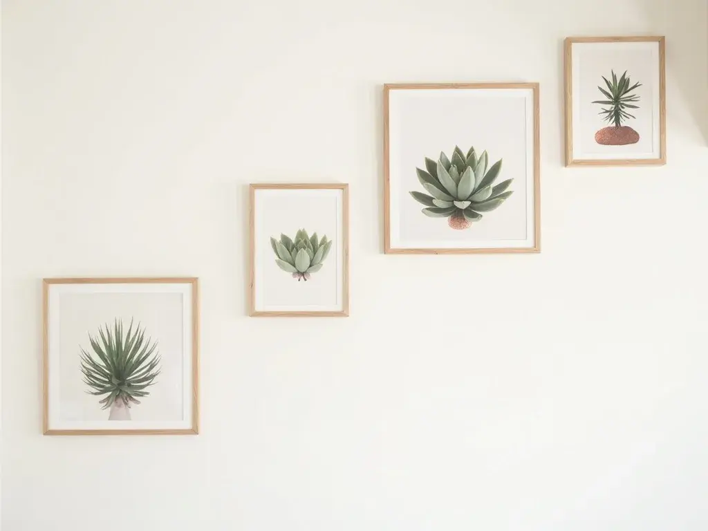
Your staircase wall is one of the longest uninterrupted surfaces in your home — and almost everyone underuses it. A single oversized frame planted halfway up feels orphaned. A random cluster of mismatched sizes looks restless. What actually works is a curated diagonal run of prints that follows the slope of the stairs, giving the eye a clear path to travel from bottom to top.
This guide is specifically about creating a gallery wall staircase with botanical prints: how to calculate where each frame goes on a slope, which sizes to choose, and how to pick a palette that works in the notoriously tricky lighting of most European stairwells. By the end, you'll have a concrete plan you can execute on a weekend afternoon.
The 15° Diagonal Rule: Placing Each Frame on a Slope
Most staircases in European homes rise at between 30° and 38° — but your gallery wall doesn't need to match the stair angle exactly. The sweet spot for a visually coherent diagonal run is a 15° offset from horizontal, which is shallower than the stairs and keeps every frame within comfortable eye-level range as you ascend.
Here's how to calculate the centre-point height for each successive frame using your riser height. Measure your riser height in cm (standard is 17–19 cm). For every step you move along the wall, raise the centre point of the next frame by 1.5× your riser height. So on a 18 cm riser staircase: each frame's centre rises by 27 cm relative to the previous one. Mark these points lightly in pencil before you touch a single nail. The bottom frame's centre should sit at roughly 145–150 cm from the floor at that step — standard eye level — and every subsequent frame climbs from there.
This formula keeps the diagonal consistent regardless of how wide each tread is, because it's anchored to the vertical rise, not the horizontal run.
Why 30×40 cm Vertical Prints Are the Right Format for a Staircase
Square prints (30×30 cm, 40×40 cm) feel static. On a diagonal wall, they read as a series of isolated stops rather than a flowing sequence. A 30×40 cm vertical format has an aspect ratio that echoes the upward movement of the stairs themselves — the eye follows each print upward and naturally wants to move to the next one.
For a staircase with a 3-metre vertical rise (very common in two-storey European homes), a set of five 30×40 cm prints is the ideal fill. Spaced at the 27 cm centre-rise increments calculated above, five prints create a run of roughly 135 cm of vertical travel — enough to populate the mid-section of the wall without crowding the top or bottom landings. Leave at least 40 cm of bare wall above the top print and below the bottom one; that breathing room is what makes the set look intentional rather than desperate.
All Flora Digital botanical prints are available as instant digital downloads sized and optimised for 30×40 cm output at high resolution. You print locally at your preferred print shop or at home, which means no waiting and no shipping damage to worry about.
Browse the full botanical print collection
Palette Guide for North-Facing Stairwells
This is where most people go wrong. They choose art they love in a well-lit living room, hang it in a north-facing stairwell, and wonder why it looks flat and cold. North-facing stairwells receive only indirect, blue-shifted daylight — cool grey art becomes visually recessive, almost ghostly.
The fix is deliberate warmth. For low-light stairwells, prioritise botanical prints in warm sage green and amber tones — the earthy, slightly golden-green of a Sempervivum rosette rendered with warm undertones, or prints where the background washes into a soft ochre or terracotta cream. These hues absorb the cool ambient light and return something that reads as alive and present rather than washed out.
Avoid prints with dominant cool blue-greens, stark white backgrounds, or heavy black linework in north-facing conditions. If your stairwell does receive some afternoon western light, you have more flexibility — dusty sage with soft ivory backgrounds works beautifully in that context and bridges naturally into a wall art for living room scheme on the landing.
A worked example: a north-facing Victorian staircase with off-white walls and dark oak banisters. Five 30×40 cm Sempervivum prints, alternating between a warm amber-background rosette and a soft sage-on-linen design, hung on the 15° diagonal. The amber tones pull warmth from the oak; the sage anchors the botanical story. No artificial lighting required to make it sing.
Framing and Hanging Without Damage
Because you're downloading and printing these yourself, you control the framing entirely. For a staircase gallery wall, thin natural oak or warm walnut frames (frame rebate depth under 15 mm) keep the wall from feeling heavy — bulky frames compete with the diagonal geometry. Avoid black frames in north-facing stairwells for the same reason as cool-palette art: they absorb the limited light rather than reflecting it back into the space.
For hanging without permanent damage — relevant if you rent, or simply want flexibility — use adhesive picture strips rated for the frame weight (most 30×40 cm framed prints in thin frames weigh under 600 g). Arrange all five frames on the floor first, adjust until the diagonal feels right, then transfer measurements to the wall one frame at a time.
If you want to visualise the full layout before committing to paper, the gallery wall planning tool lets you arrange prints digitally against a wall template — useful for staircase slopes where standard grid planners fall short.
You now have everything you need: the formula for placing each frame on the slope, the exact sizes and set count for a 3-metre rise, and a palette strategy that actually works in low-light conditions. The only thing left is choosing the prints themselves.
Explore botanical wall art sets sized for your staircase — all instant digital downloads, ready to print this weekend.