You've finally found the perfect sofa — the right depth, the right shape, and that shade of fabric you've been hunting for months. But then you look at the wall behind it and feel that familiar, slightly deflating blank. Choosing the right wall art for your living room shouldn't be an afterthought, and it certainly doesn't need to be stressful.
Matching wall art to your sofa is genuinely one of the most satisfying things you can do for a room. When colour, tone, and mood align between your furniture and your art, the whole space clicks into place. Here's how to make that happen — with a little help from the quiet, enduring beauty of the botanical print.
Start With Your Sofa's Undertone, Not Just Its Colour
Most people look at their sofa and think in broad strokes: it's grey, it's green, it's cream. But the real key to matching wall art to your sofa is understanding its undertone — that subtle warmth or coolness running beneath the surface colour.
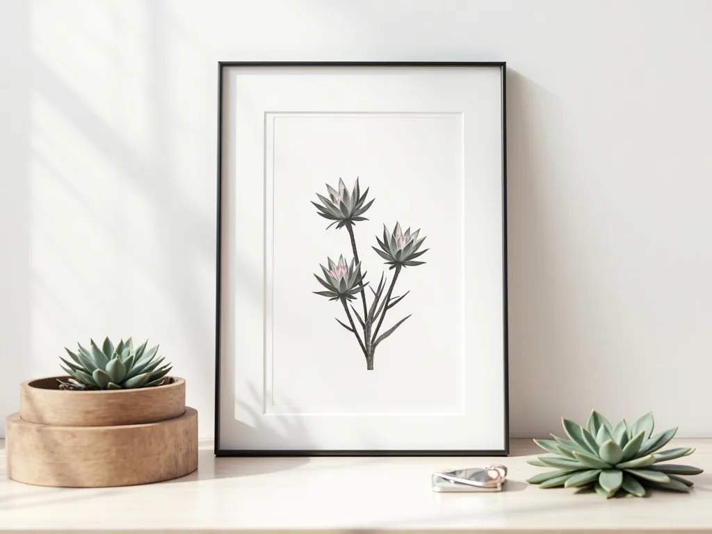
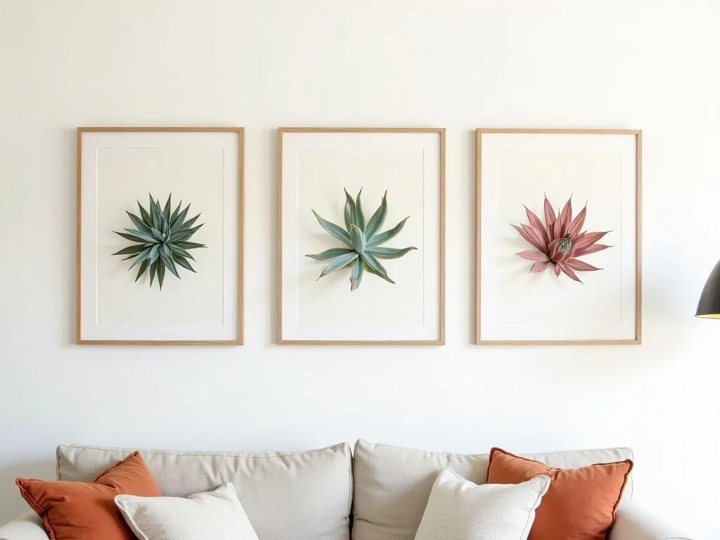
A grey sofa, for example, might lean towards a cool, bluish slate or a warm, almost greige territory. A terracotta velvet piece carries distinctly warm, earthy undertones. Once you identify this, you have a compass for every other decision in the room. For botanical prints specifically, this matters enormously. Sempervivum succulents are rendered in a remarkable range of tones — from the silvery blue-green of S. tectorum rosettes to the deep burgundy and plum of S. 'Commander Hay'. Matching the undertone of the print to that of your sofa creates a sense of effortless coherence, even when the colours themselves are quite different.
A quick way to test this: hold a fabric swatch or cushion cover next to a printed colour palette and notice whether the two feel harmonious or if one looks slightly off. That slight discord is the undertone mismatch you want to avoid.
Complementary vs. Analogous: Two Reliable Approaches
Once you know your sofa's undertone, you can approach colour pairing in two confident ways.
Complementary pairing places colours from opposite sides of the colour wheel together — think a deep teal sofa anchored by a botanical print with warm amber and rust tones, or a dusty rose linen chair balanced by a print in muted olive and sage. This approach creates visual energy and interest without ever feeling chaotic, especially when the tones are kept soft and desaturated.
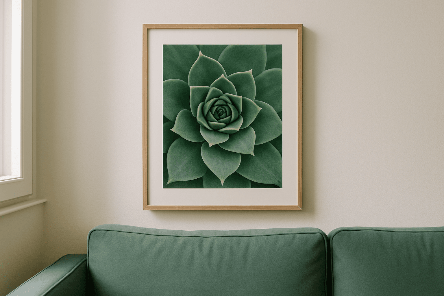
Analogous pairing keeps everything within the same colour family, building a room that feels quietly layered and cohesive. A warm cream sofa, warm oak furniture, and a Sempervivum botanical print in honey greens and ochre will wrap a room in a gentle, lived-in warmth that is genuinely difficult to tire of.
Neither approach is more sophisticated than the other — the choice depends entirely on the mood you're after. High contrast and personality? Go complementary. Calm and enveloping? Go analogous.
How Furniture Finishes Affect Your Art Choice
Your sofa is rarely working alone. The coffee table, shelving, and any accent pieces all contribute to the room's overall colour temperature, and your wall art for living room needs to speak to the whole ensemble, not just the largest piece of upholstery.
Dark walnut or stained oak furniture tends to absorb light and adds visual weight. In these rooms, a botanical print with lighter background tones — soft stone, pale cream, or a washed-out sage — will lift the eye and balance the heaviness beautifully. Conversely, a room with pale, bleached-wood or white-lacquered furniture has all the lightness it needs; here, you can afford a print with greater tonal depth, allowing a richly coloured Sempervivum study in deep green and burgundy to become the focal anchor the space is missing.
Metal finishes matter too. Brass and gold accents call for prints with warm, golden-hour tones. Brushed steel and chrome sit best alongside cooler, more minimal compositions. Think of your botanical print as the final instrument in an orchestra — it doesn't need to play the same note as everything else, but it does need to be in tune.
Size, Placement, and the 60 cm Rule
Colour is only part of the equation. A beautifully chosen botanical print that is simply too small for the wall above your sofa will read as an afterthought rather than an intention.
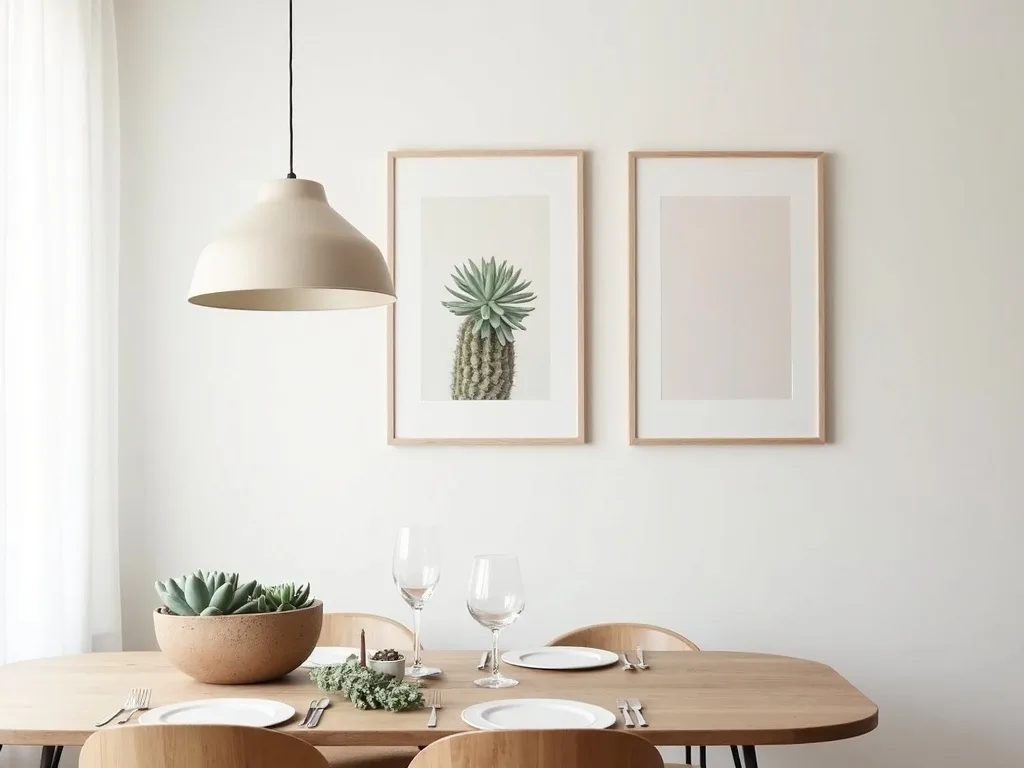
As a general guide, the artwork should span roughly 60–75% of the sofa's width. For a standard 220 cm three-seater, that means looking for a print — or a curated grouping — covering around 130–165 cm horizontally. Because Flora Digital's pieces are sold as instant digital downloads, you have complete flexibility: download once and print at whichever dimensions your wall demands, whether that's a single dramatic 70 × 90 cm statement piece or a pair of coordinating 50 × 70 cm prints hung symmetrically.
Hang the base of the frame approximately 20–25 cm above the sofa back. This keeps the art visually connected to the furniture rather than floating independently on the wall.
Find Your Palette in the Collection
Matching wall art to your sofa becomes genuinely enjoyable once you have the right starting points — and the botanical print offers a natural palette that works harmoniously with almost every furniture style, from Scandinavian minimalism to warm Mediterranean interiors.
Browse the full range of studio-designed Sempervivum studies and find the tones that speak to your space. Every piece is available as an instant digital download, ready to print and hang at the perfect size for your wall. Explore the botanical collection and start matching.