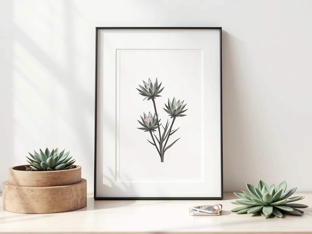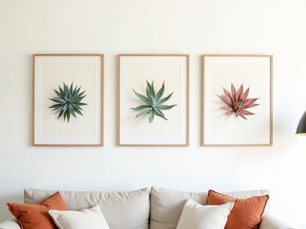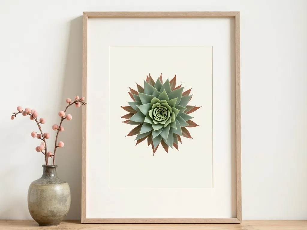
There is something quietly authoritative about a botanical print hung on a living room wall — the fine engraved lines, the amber warmth of aged parchment, the sense that someone once spent weeks observing a single plant with total devotion. That feeling does not belong to the past. In 2025 interiors across Europe, the vintage botanical aesthetic is not a nostalgic gesture; it is the dominant visual language of considered, grown-up decorating.
If you have been searching for wall art for your living room that earns its place on the wall rather than simply filling it, this guide will show you exactly why botanical illustration endures, how to hang it with confidence, and which palettes make it sing in today's homes.
From 18th-Century Herbaria to the Contemporary Wall
The golden age of botanical illustration ran roughly from 1700 to 1850, when scientific expeditions commissioned artists to render newly discovered flora with both precision and beauty. Works produced for publications like Curtis's Botanical Magazine set a visual standard that has never truly been surpassed: hand-engraved outlines filled with controlled watercolour washes, each leaf vein mapped, each petal given weight and shadow.
What made that aesthetic so compelling — and so durable — is the tension it holds between science and art. The illustrations were documents, but they were also objects of beauty. The aged-parchment ground, the warm sepia ink, and the restrained ochre highlights signal knowledge, patience, and permanence. Modern interiors, saturated with flat digital graphics and fast-trend prints, are starving for exactly that quality.
Today, studio-designed botanical prints continue that lineage. Contemporary pieces are rendered with the same tonal restraint and engraved-line aesthetic, now available as instant digital downloads — no waiting, no shipping, no compromise on quality. The result is wall art for living rooms that reads as heirloom but lives entirely in the present.
How to Build a Cabinet-of-Curiosities Wall
The most compelling way to display a vintage botanical print collection is to channel the Wunderkammer — the cabinet of curiosities that 18th-century collectors assembled to show the natural world in all its variety. Here is a layout that works in almost any living room with a wall span of at least 160 cm:
- Choose your centrepiece first. Select one oversize print at 50 × 70 cm — a single Sempervivum rosette rendered in rich sepia tones works beautifully as the visual anchor. Hang it at eye level, roughly 150 cm from floor to centre.
- Flank it with three portrait prints at 30 × 40 cm. Position one directly to the left, one directly to the right, and one above the centrepiece — all edges aligned to an invisible 10 cm margin around the large print. The asymmetry of three around one creates movement without chaos.
- Frame everything identically. Thin, flat matte frames in raw oak or warm black unify the grouping and let the illustration do the work. Avoid ornate gilded frames — they compete with the print's own line-work.
- Leave the wall between prints intentionally bare. A 10–12 cm gap between frames gives each piece room to breathe and reinforces the curated, gallery feel.
All four prints download at high resolution, so printing to these exact sizes at any professional print shop costs a fraction of buying originals — and the result is indistinguishable at wall distance.
Palette Pairings That Make Vintage Botanical Art Work in 2025
Colour context transforms a botanical print from merely pretty to genuinely powerful. Two pairings are performing exceptionally well in current European interiors:
Aged ivory + forest green + rust on white walls. This is the classic natural-history palette updated for modern living rooms. The warm ivory of the print's background lifts against a clean white wall, while ochre and rust tones in the illustration echo terracotta accessories and linen upholstery. A deep forest-green throw or velvet cushion anchors the whole scheme. This combination suits north-facing rooms especially well — the warm tones compensate for cooler daylight.
Warm oat + charcoal line-art on dark-painted feature walls. For the growing number of European homes using deep tones — charcoal, ink blue, or bottle green — on a single feature wall, a botanical print with a warm oat-coloured ground and fine charcoal engraving lines creates a luminous contrast. The print appears to glow against a dark ground in a way it never does on white. Keep the frame matte black for a seamless effect.
In both scenarios, avoid mixing metallic finishes near the print. The hand-crafted aesthetic of a botanical illustration is grounded in matte, natural textures.
Framing-Free Options and Light Placement
Not every wall calls for a frame. For a more minimal approach, prints at 30 × 40 cm work beautifully with slim clip hangers in brass or matte black — the hardware adds a quiet artisan detail. Washi tape mounting suits temporary or rented spaces and does no wall damage. For larger sizes like 50 × 70 cm, a simple poster rail (two thin wooden dowels top and bottom) gives the piece a relaxed, studio-atelier quality.
Light matters enormously. Natural side-light reveals the tonal depth of aged-parchment prints best — place them on a wall perpendicular to a window rather than opposite it, which causes glare on glass. If you are using picture lights, warm-white LED (2700–3000K) preserves the ochre and sepia tones; cool daylight strips flatten them.
Bring the Aesthetic Home
A genuine vintage botanical print — aged lines, parchment warmth, botanical precision — is not a trend that ages badly. It is a visual register that has survived three centuries because it rewards careful looking. The only question is where on your wall it belongs.
Explore the full range of downloadable Sempervivum botanical prints, from intimate 21 × 29 cm studies to statement 50 × 70 cm compositions, in our botanical wall art collection. If you are planning a multi-print gallery wall, the gallery wall tool helps you map exact spacing before you download a single file.